Cority Corporate Rebrand
Empowering Those Who Transform the Way the World Works
Environmental, Health and Safety Software (EHS) is responsible for among other things, bringing workers home safely and providing Enterprise with the tools to manage, sustain and protect Earth’s precious resources. In 2023, the EHS software industry was estimated to be worth $1.81 billion USD. There are roughly five companies that compete for the lion’s share of global enterprise engagements.
With a 35 year history and proven track record, Cority built an enviable stable of loyal customers and unrivaled industry expertise. They were consistently positioned by industry analysts as one of the top companies in the EHS category, finding their way in most analysts reports in the upper right quadrant as a “leader”. Their success led them to a series of acquisitions of smaller competitors and eventually to majority investment ownership by Private Equity firm Thoma Bravo in 2019.
The challenges Cority faced post-acquisition were not entirely unique and fell into three broad categories: 1) How do move from being a good company to a great one? 2) How to unify the sum of their parts into one cohesive entity that is greater than the sum of those parts? And, 3) how to do this on an accelerated timeline, in the face of so much rapid and unrelenting change?
Cority is in the business of creating technology that brings people home safely while protecting the earth’s precious resources. Our strategy was to shift the brand’s focus from how they do this, to why, by bodaciously declaring, “it’s time to think differently about the future”, reuniting the company and their customers with what they most cared about – protecting people and our planet.
Project
Cority Corporate Rebrand
Category
Environmental, Health and Safety Software
Services
Brand Strategy
Market Research
Brand Architecture
Brand Identity
Brand Extension
Content Development
Digital Design
Information Design
Motion Graphics
Video Design
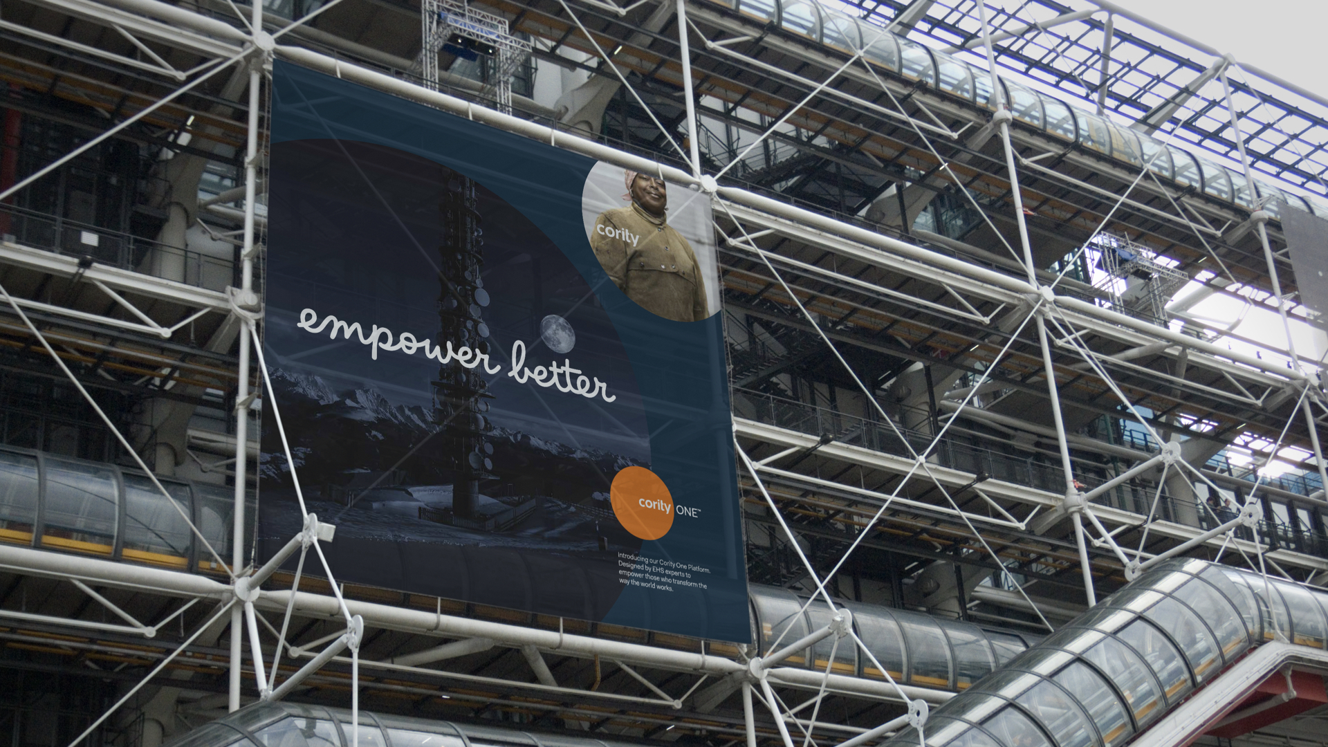
[↑] Introduction to the new Cority brand
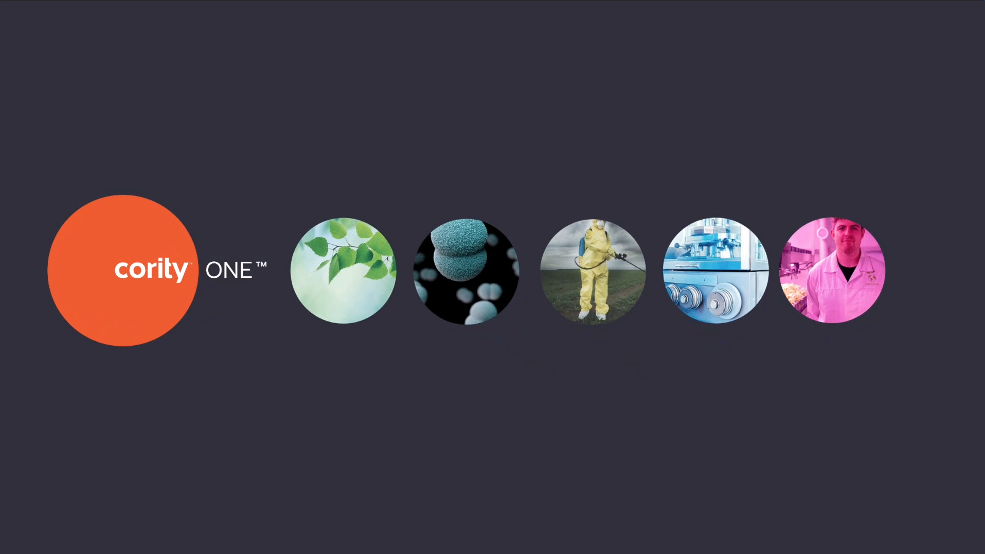
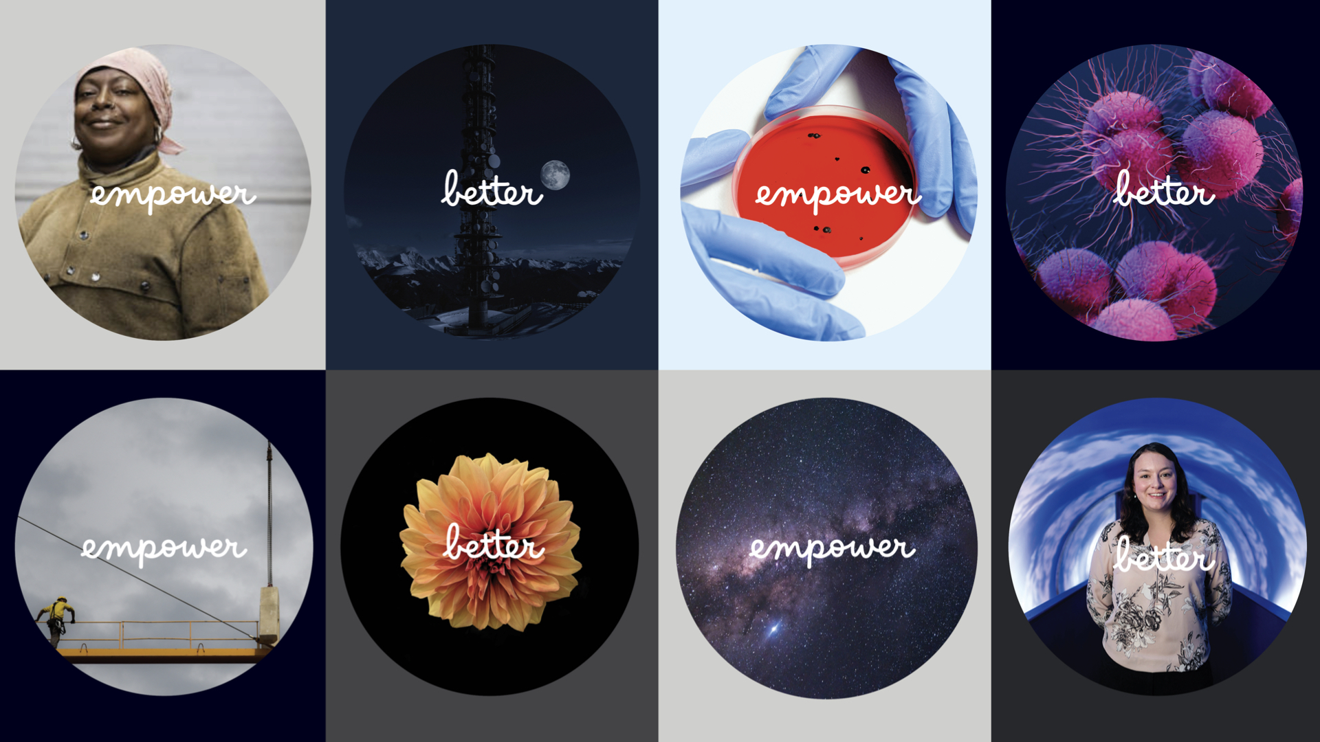
The organizing principle driving the new brand was the need to design a system (a kit of parts) that was flexible, easy to navigate, and scalable for a future that was still unfolding.
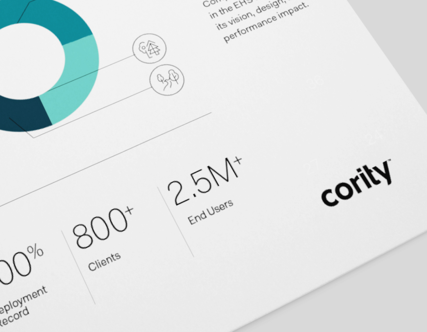
It's not rocket science, but the devil is always in the details, and this is a program based on all those details.
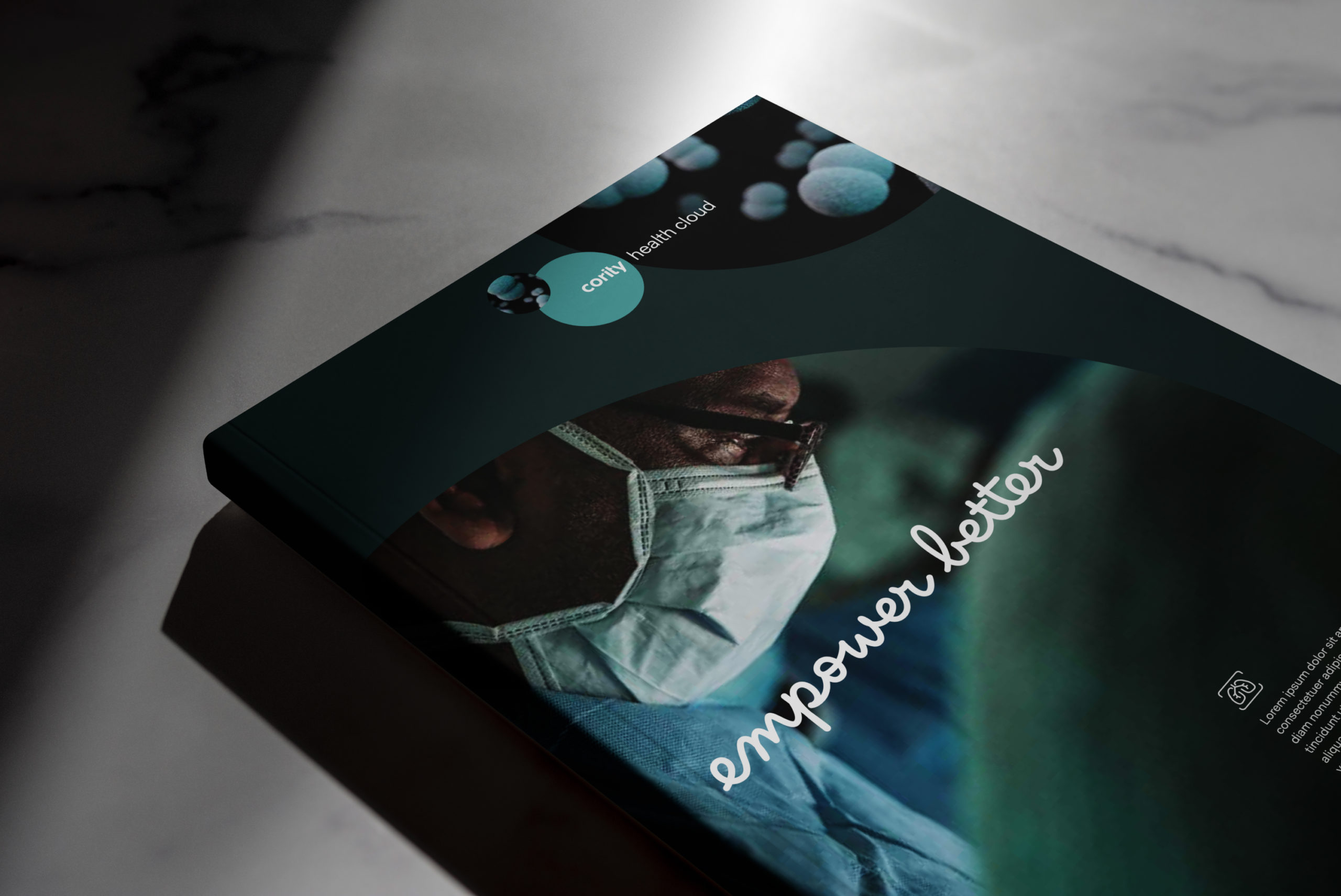
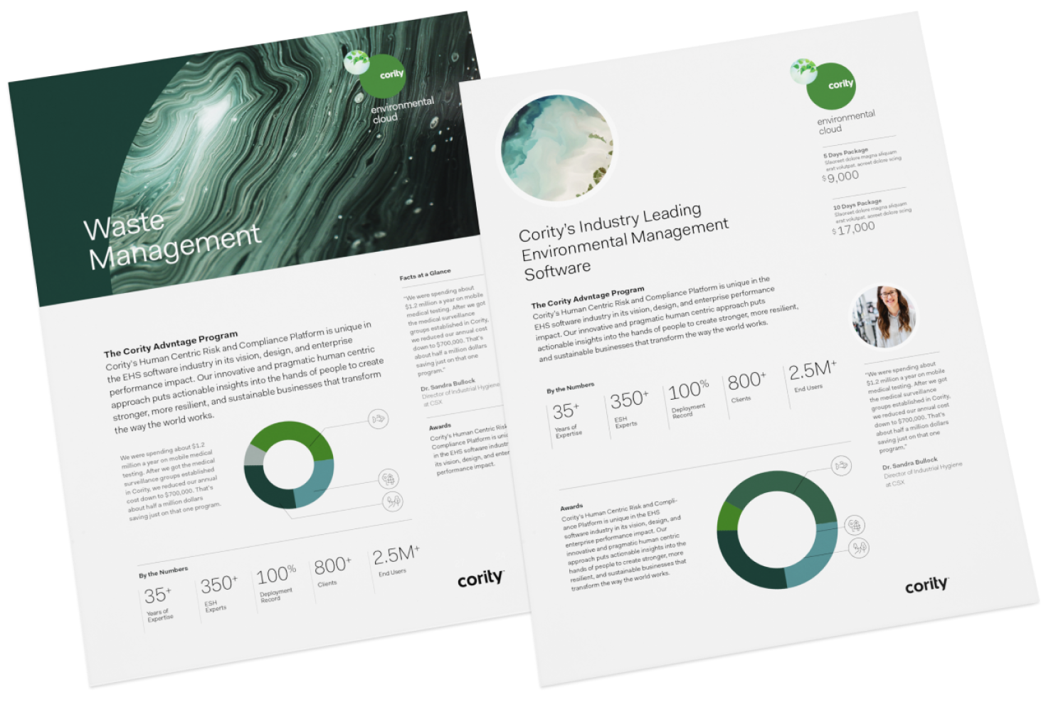
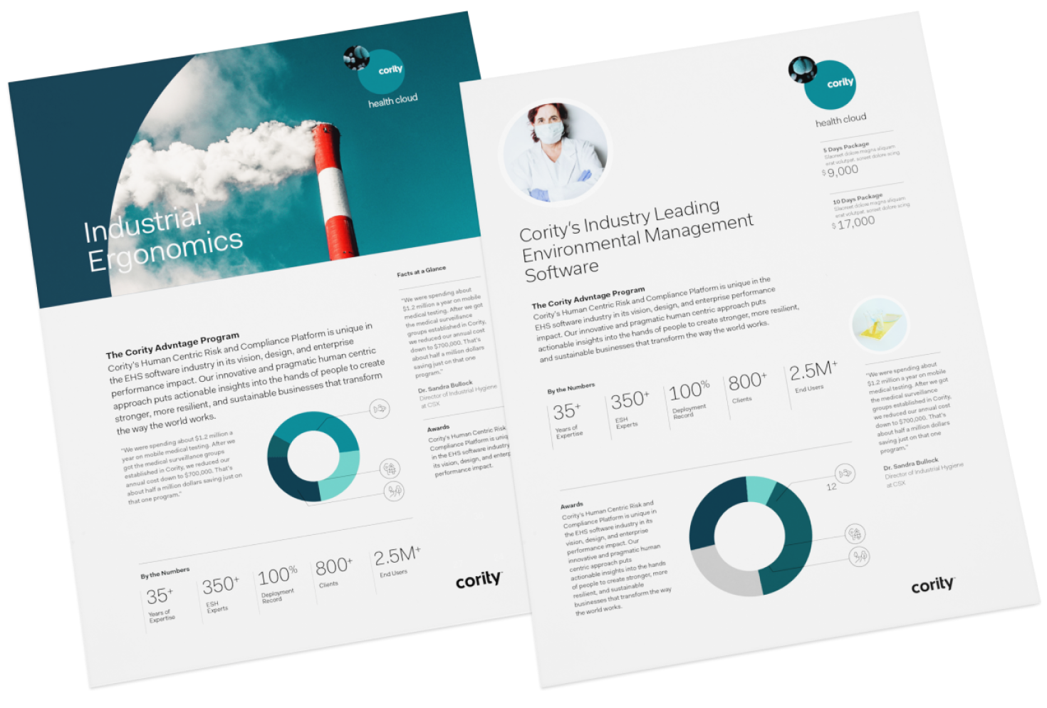

[↑] Cority Brand Guidelines
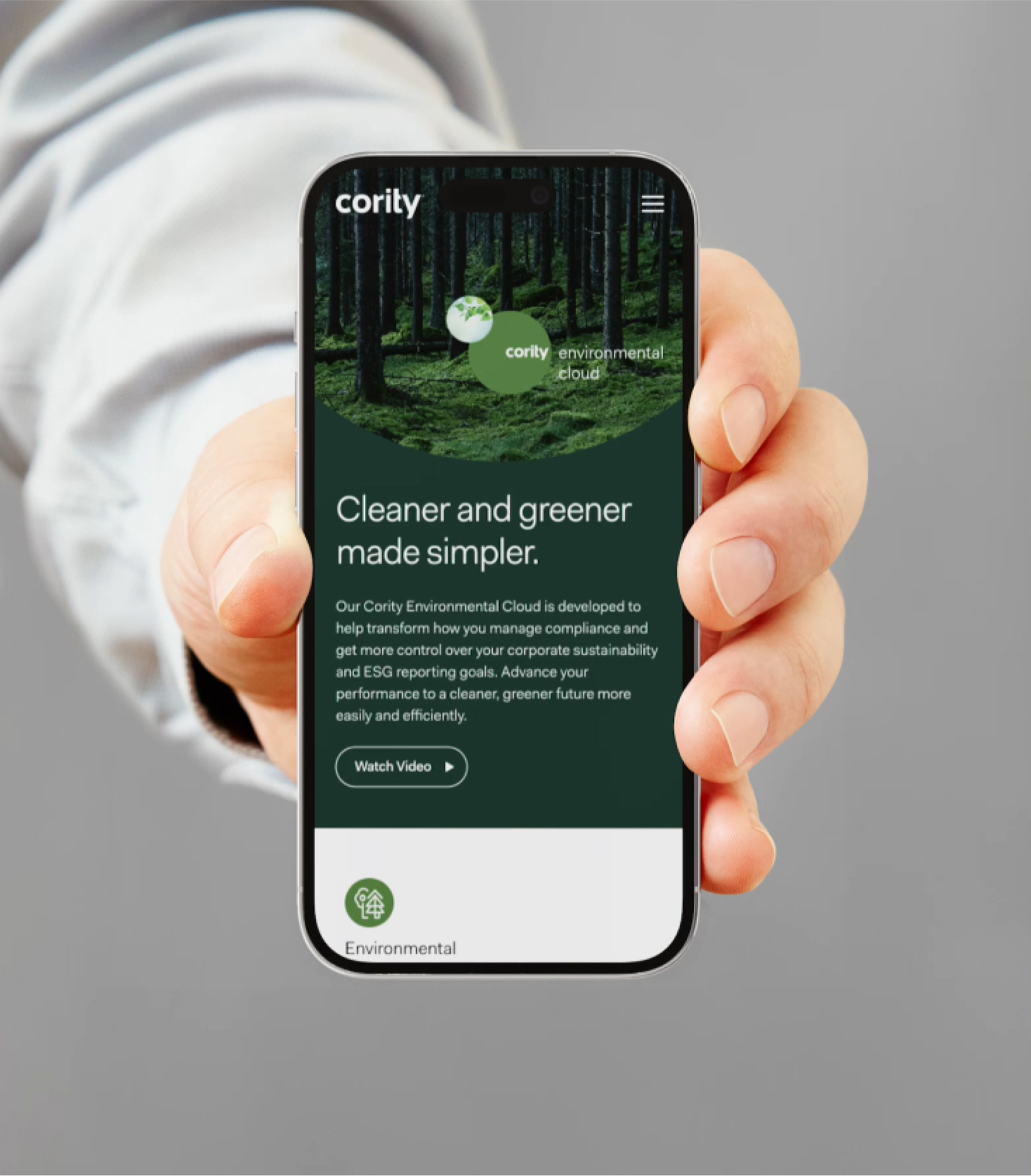
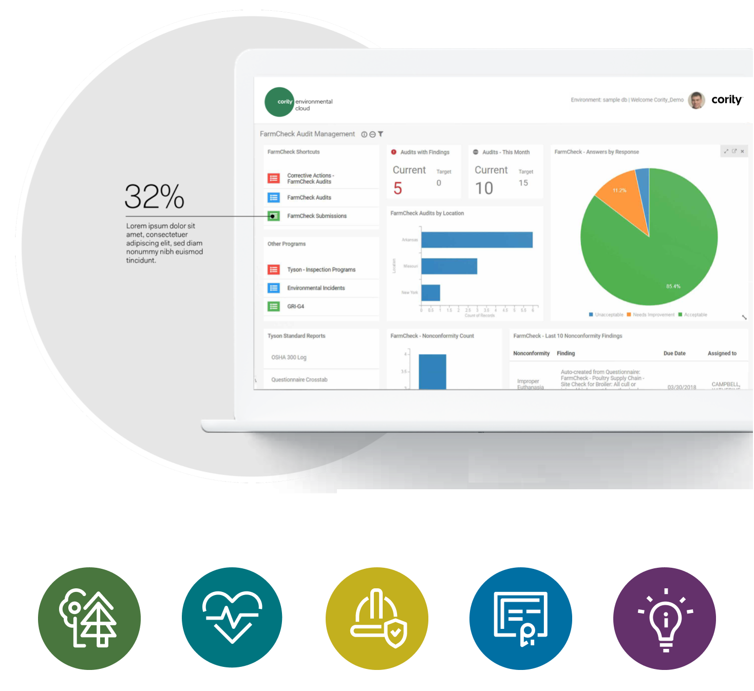
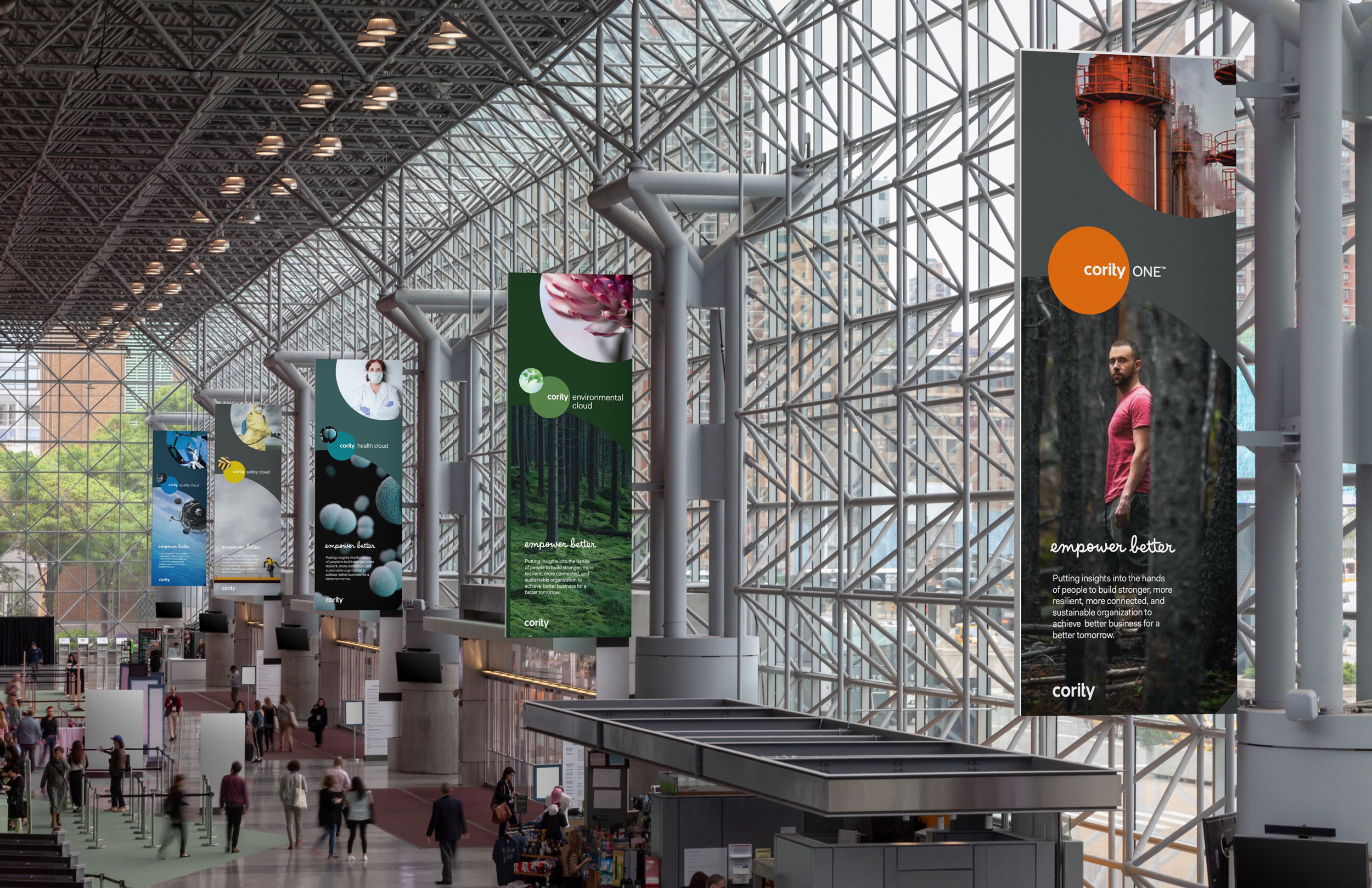
The solution, rearchitect the brand into a streamlined set of 6 cloud based solutions all interconnected on one seamless platform and linked through nomenclature to the company’s foundational promise of “empowering better...” Additionally, using the same core system elements of color, typography and imagery to differentiate each from the other, while still linking all back to the master brand.
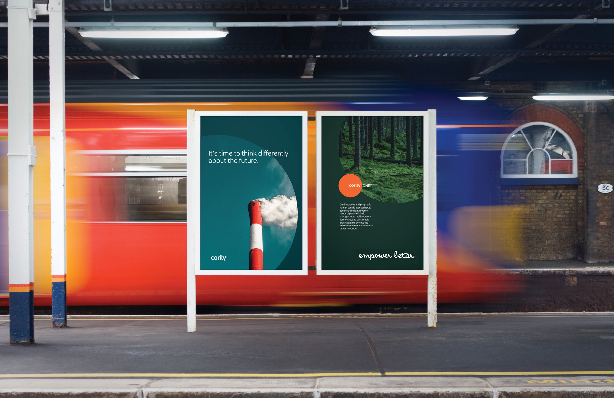
It’s time to think differently about the future.
While the direct impact of any rebrand is notoriously difficult to quantify in concrete business metrics, since their relaunch, Cority’s growth on every front has been pretty epic.
I’ve worked with multiple creative and branding agencies over my career. Simply put, RLD is the best. The work speaks for itself and really sets us apart in the crowded enterprise B2B software space that we operate in. They quickly understood our highly niche market and our unique position in it, collaborated seamlessly in developing a strategy, offered outstanding creative options, helped us gain buy-in at the Board level, and provided highly responsive and professional support as we executed.
Michael Couture — Chief Product Officer, Cority
Behind every powerful brand is an even more powerful story.
© Rick Lowe Design. All Rights Reserved